Girasasso Wine, Maremma
When I was in Maremma I discover one more wine brand Girasasso.
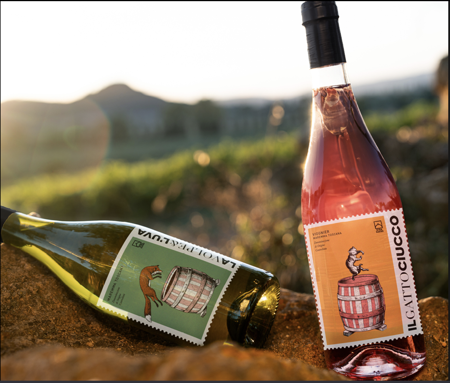
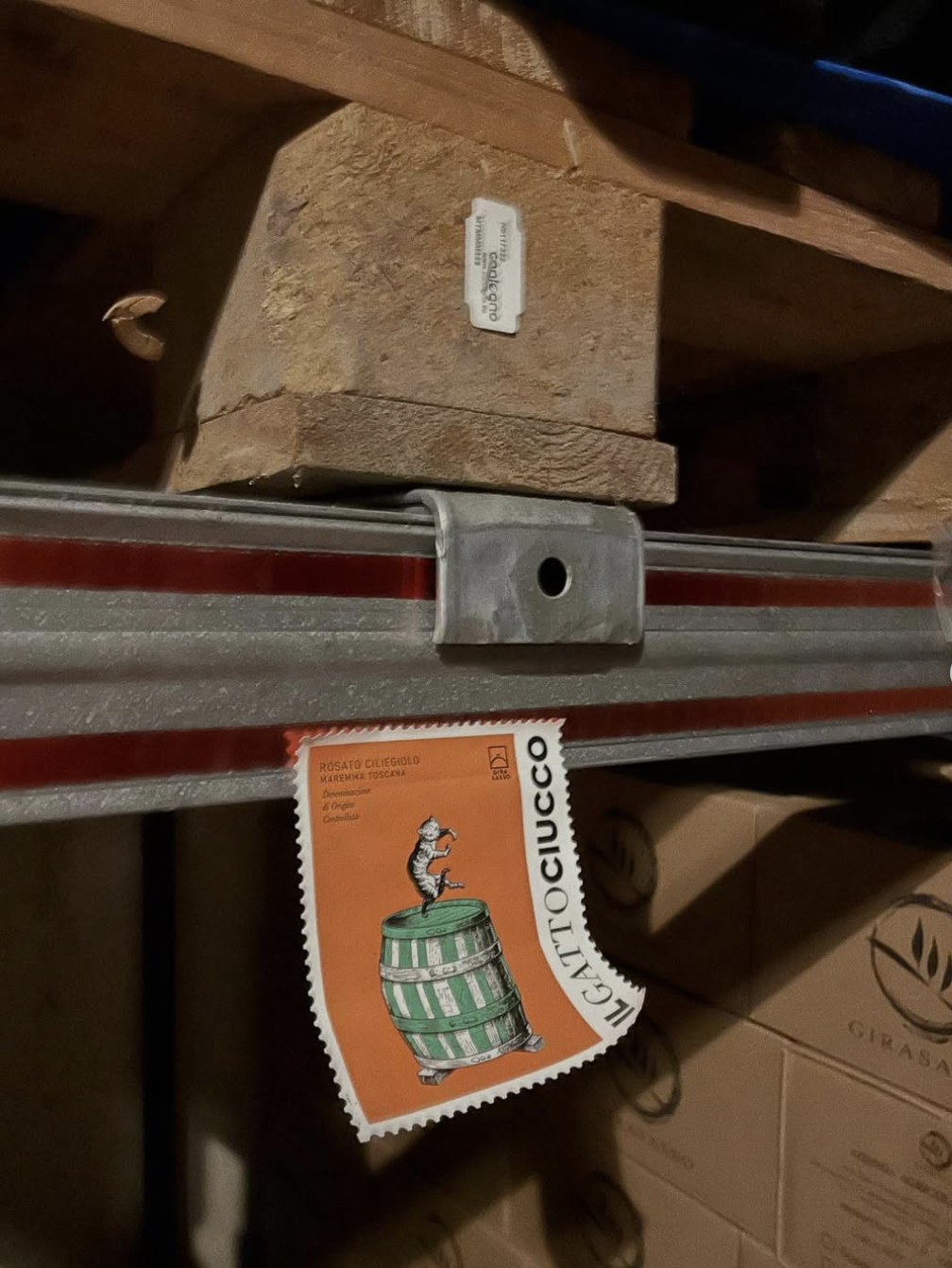
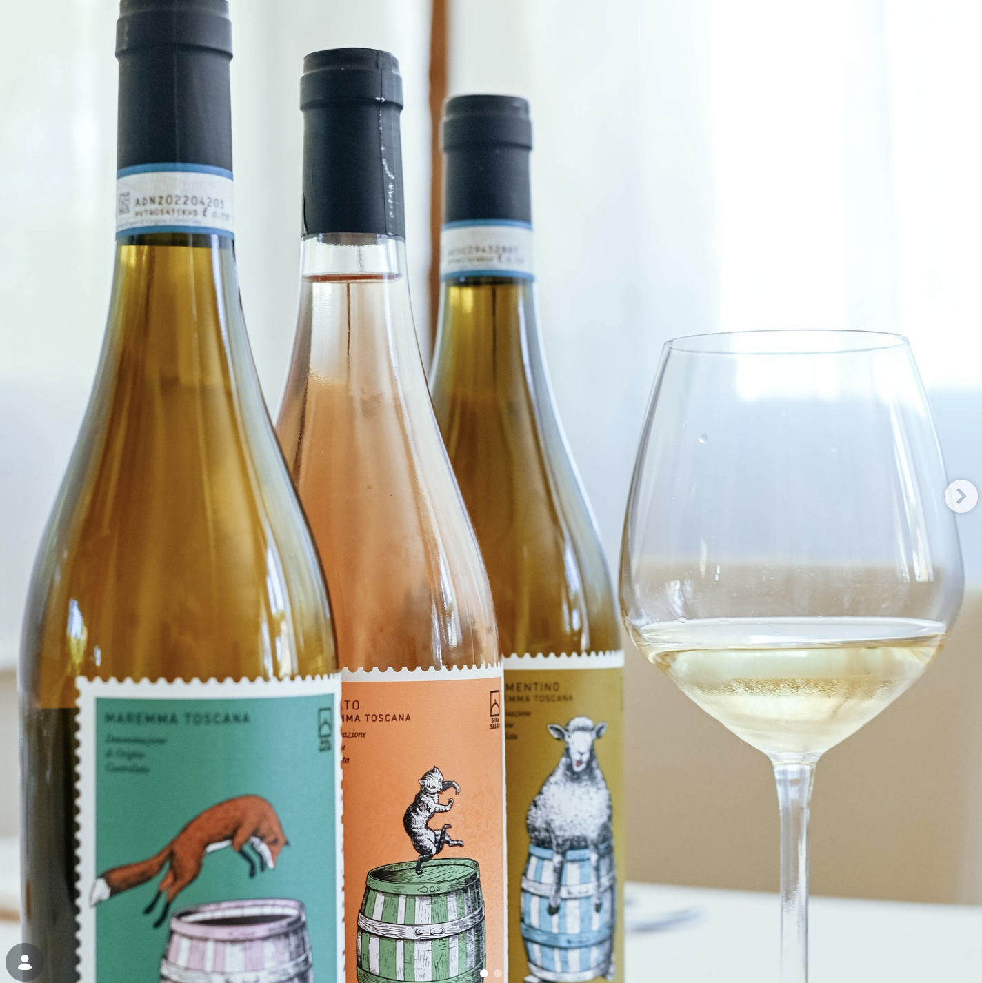
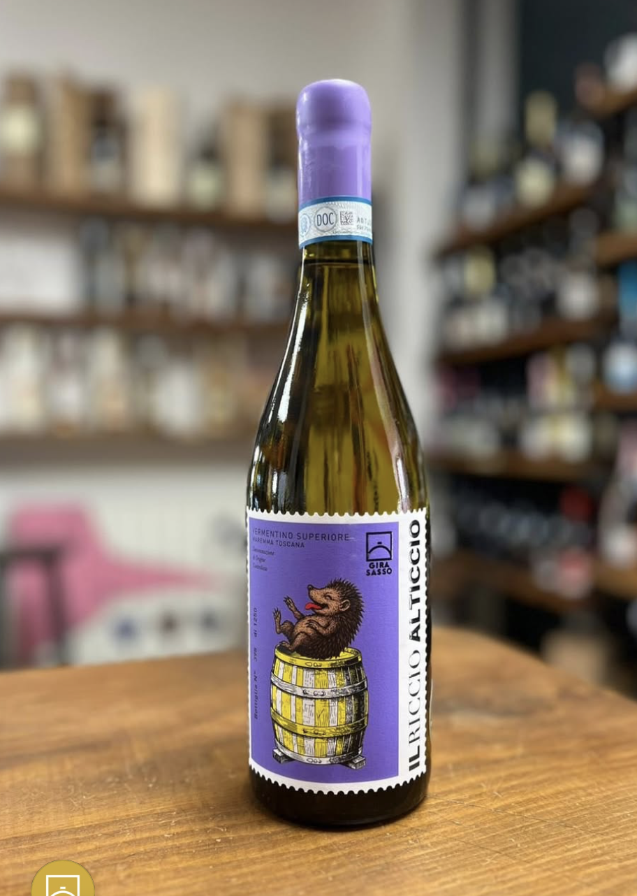
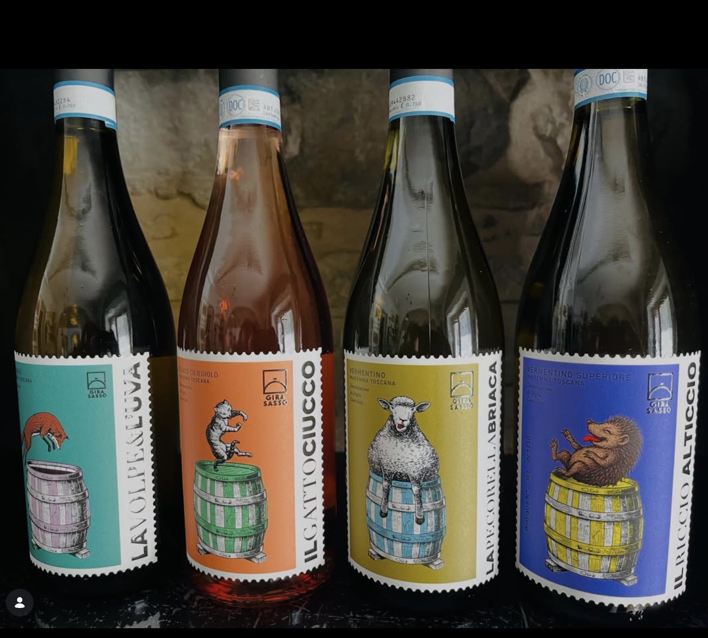
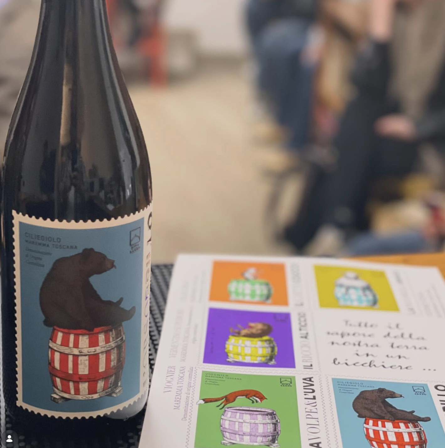
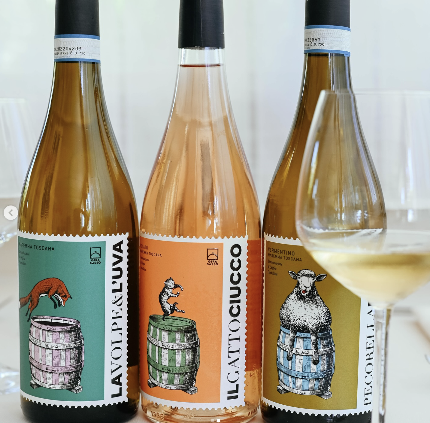
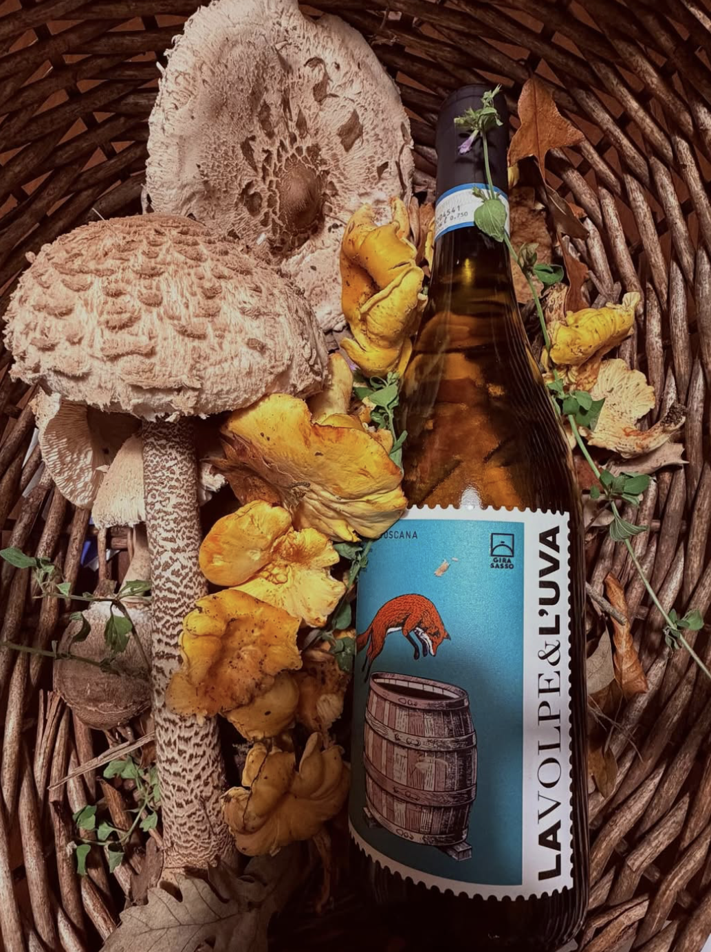
Some food labels do more than identify a product they tell a story before you even pick it up. Girasasso is a great example of how thoughtful label design can express authenticity, craftsmanship, and a deep connection to nature without relying on complex graphics or excessive decoration. One of the first things that stands out is the clarity of the design. Every element has a purpose, and nothing feels unnecessary. The labels are clean, balanced, and easy to read, allowing the product itself to remain the main focus. Rather than following short-lived design trends, the visual identity reflects the landscape, traditions, and agricultural roots behind the products. This creates an immediate feeling of authenticity and helps consumers connect with the brand on an emotional level. Earthy greens, warm neutrals, soft yellows, and muted tones create a visual language inspired by nature. These colours communicate freshness, sustainability, and quality without relying on stereotypical "organic" design clichés. One of the most valuable lessons from Girasasso is that good packaging doesn't need to be visually loud. Through thoughtful composition, restrained colour choices, and attention to detail, the labels communicate quality, trust, and craftsmanship in a quiet but powerful way.